Similarities and differences


What are the similarities and differences?
The similarities with both of the artists work is that they are both made out of paper, and they are both really detailed and they are eye catching and interesting because its like a new piece of art that some people might of not seen before.
The differences are that Francis' art work is way more eye catching and detailed than Jerry’s because he has a lot of patterns going on and Jerry’s is really simple just plain and not that eye catching but Jerry's you cans see more clearly because I think the light hit the art work better and with Francis it look a bit more jumbled.

I have chosen this image as my image idea because out of all of his art works this was the one that interested me the most, because of all of the way the light is and the materials they used. I would recreate this image using card a scalpel, and a light so I can get the shadow like Jerry Reed has.

I would like to research this image because it has the most interesting shapes and all the swirls, but it looks like it has been reflected and the way Francis has done it is interesting and the way the light reflected of them is nice.
Gallery


Noticing the light
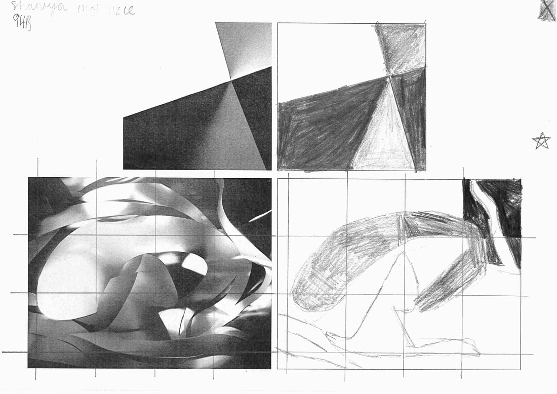
We were given pencils and asked to draw these pictures of noticing the light.
What did you do?
We had to re draw both of these art works to try make it look like identical.
Why do you think your teachers made you do it?
They probably made us do it because we could learn to shadow while we're drawing.
How did it feel?
I hated it a lot.
Concertina Book
A Concertina Book is lots and lots of folds.
|
|
what is a concertina book?
A concertina book is a booklet is an origami pop up book and it called a concertina book because the folded structure resembles a concertina |


My concertina book is pictures of my Rome trip. my first time making a concertina book I linked up all the pictures to make it
WWW- that my concertina book is different to everyone else
EBI- If I could of fitted all my pictures all of my pictures onto one side and try make double fold
WWW- that my concertina book is different to everyone else
EBI- If I could of fitted all my pictures all of my pictures onto one side and try make double fold
POST IT EDGES


These are some of my favourite pictures i took, we were asked to take pictures but we only had post it notes and create different shapes with the post it notes


Paper edges analysis
Describe how you think each of the pictures were made?
I think the picture was made with cutting the paper out and cutting different shapes using different of shadows.
What kind of lines can you see in each picture?
Curved lines, straight lines, swerve lines.
Explain the different kind of light in each pictures?
Francis Bruguiere the light he is using is shadows but theirs a lot of light. Vieko sager there're only two shadows then the rest of his pictures there is just light.
Choose 3 words to describe the pictures ?
Sager-sharpe edges, stiff, boring.
Bruguiere-dramatic, light, moody.
Which picture do you prefer?
I prefer Francis Bruguiere because it is more interesting and more eye catching and the shapes he has used are very interesting.
Chatter box and Edges


we were asked to go outside with a camera and mirror and take pictures and these are some of the pictures i took
Edges Assessment
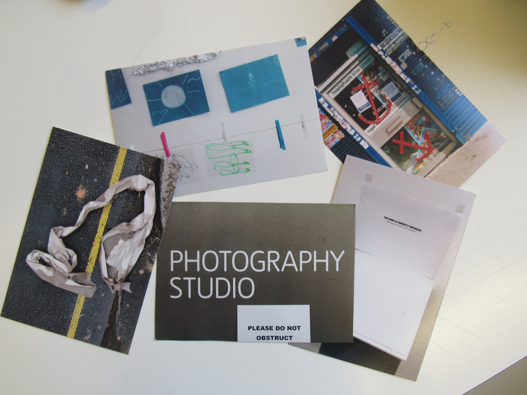
i have chosen these 5 pictures because the person that has taken them was very creative, some people might think they're boring and basic but they caught mr attention because they're are simple and not over the top


What went well & Even better if
WWW: that my pictures came out better than expected and some of them came out blue
EBI: they all were not from the same angle and some of them were different
EBI: they all were not from the same angle and some of them were different
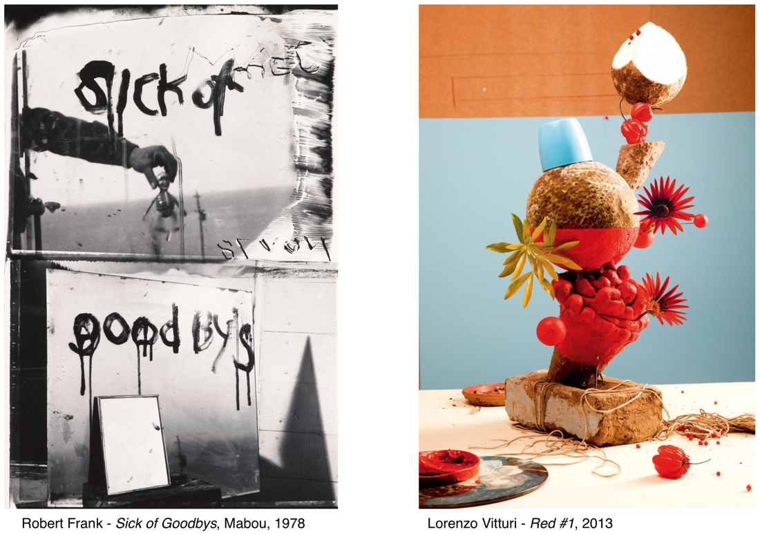
Robert Frank- image looks like it's to do with Halloween because it looks like it has been taken in somewhere that is abandoned, because of the writing.
Lorenzo Vittori- it has very bright colours and looks like there is fruit and vegetables and more.
Both of the pictures portraits, probably and probably has something to do with Satan, or he was disturbed with his life and, his is black and white.
Lorenzo Vittori's image is made out of fruit and flowers and, there is a blue cup in it.
The main similarities between these pictures are nothing really, because they both are really different, because they're like moods. Robert Frank is like you're upset and Lorenzo Vittori is like you're in a happy mood, but both of the pictures are portrait. Robert Frank - all of his writing on the mirrors is squashed together and Lorenzo Vittori all of the fruit on the bottom is spread out, but the pasta looking thing is all bundled together.
The kind of edges I can see are straight, wonky, pointy and I don't think these edges will help you about seeing edges in photography.
Question to Robert Frank?
Why do you choose to do dark pieces of art?
Question to Lorenzo Vittori?
Why do you choose to do art with fruit and flowers?
If I was to live in Robert Frank's piece of art, I would feel depressed, scared, lonely.
If I was to live in Lorenzo Vittori's photo, I would feel confused and happy.
Sick of Satan- Robert Frank.
Blue/Red - Lorenzo Vittori.
All pictures have edges no matter what because it's all flat.
paper sculpture/colour sculptures - Frank Gehry response.


What I like about my work is how different it is I used 3 different colour stripes of coloured paper and all I done was staple sand staple until I made this weird shape. The colour in the yellow background brings out all of the colours so it doesn't look boring so it looks kind of interesting
EBI: My pictures were not as dark as they're and if you couldn't see the paper and stuff in the background in some of the pictures
EBI: My pictures were not as dark as they're and if you couldn't see the paper and stuff in the background in some of the pictures
